

Color choices shape how a new home lives, not just how it photographs. In 2026, homeowners are choosing palettes that feel warmer, softer, and more layered than the cool-gray era.
If you’re researching colors for your new Colorado home, keep local light in mind from the start. Colorado sun can brighten undertones and exaggerate contrast, especially in open layouts with large windows. Below, we list some of the color combinations for new homes that are trending in 2026.
Warm White + Soft Greige + Matte Black
This combination gives you a clean backdrop without drifting into stark white. Warm white walls keep the home bright, while soft greige adds depth to the cabinetry, tile, or upholstery. Matte black brings crisp structure through lighting, plumbing fixtures, or window frames.
Use this palette when you want modern contrast that still feels welcoming. It works especially well in open-concept main floors where you want consistent neutral flow. If your floors lean warm, choose a greige with a gentle beige undertone to keep everything cohesive.
Cream + Mushroom Taupe + Aged Brass
Cream reads softer than bright white, which helps new spaces feel settled faster. Mushroom taupe adds a tailored, high-end tone that works beautifully on built-ins, interior doors, or bathroom vanities. Aged brass warms the whole look and pairs well with both creamy paint and natural stone.
This palette suits homeowners who want “quiet luxury” without going too minimal. It also plays nicely with textured materials like Zellige-style tile, honed stone, and plaster-like wall finishes.
Sand Beige + Warm Oak + Muted Olive
Sand beige creates an easy, sunlit base that still feels grounded. Warm oak brings natural richness through flooring, ceiling details, or cabinetry accents. Muted olive adds an organic color note that feels calm rather than trendy.
Choose this combination if you want your home to connect to the outdoors. It works especially well in kitchens with oak islands, pantry doors, or open shelving. Olive looks best when you repeat it subtly—think a tile tone, a painted mudroom cabinet, or a built-in bench.
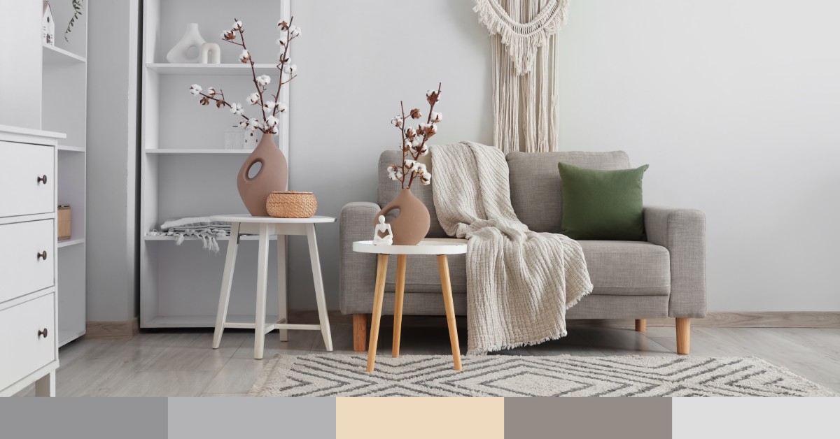
Off-White + Charcoal + Natural Stone Gray
Off-white keeps rooms bright while softening the edges compared to a pure white. Charcoal adds drama in a controlled way, especially on islands, stair railings, fireplaces, or exterior accents. Natural stone gray ties everything together and feels timeless in countertops, tile, and masonry.
This trending color combination for new homes in 2026 fits homeowners who want a modern structure without a cold feel. If you use charcoal in large doses, balance it with lighter flooring or warm wood elements so the home still feels inviting.
Putty Beige + Clay + Weathered Bronze
Putty beige delivers a modern neutral that feels current without feeling “gray.” Clay introduces warmth and personality, especially in tile, accent walls, or a statement powder bath vanity. Weathered bronze finishes the palette with depth that feels more relaxed than shiny metals.
This combination works well for homes that lean earthy or Mediterranean-inspired. Clay tones look best when you keep them slightly muted, not overly orange. Bronze hardware and lighting can make even a simple cabinet door style look more custom.
Light Greige + Dusty Blue + Brushed Nickel
Light greige gives you a flexible foundation that plays well with both warm and cool accents. Dusty blue adds softness and calm, especially in bathrooms, bedrooms, and laundry rooms. Brushed nickel brings a clean finish that doesn’t compete with the blue.
This palette fits homeowners who want a fresh look that still feels classic. In strong natural light, choose a blue with a gray base so it stays sophisticated.
Soft White + Deep Green + Warm Wood
Soft white keeps the home bright and makes deep green feel intentional rather than heavy. Deep green adds a moody, upscale note in kitchens, offices, or libraries. Warm wood balances the richness and keeps the palette feeling livable.
This combination works especially well when you want a “designer” look without loud color everywhere. You can use green on an island, perimeter cabinetry, or a built-in media wall. Repeat the warm wood tone in beams, flooring, or furniture to keep the palette cohesive.
Pale Beige + Terracotta + Linen Neutrals
Pale beige sets a gentle, sun-warmed base that feels relaxed. Terracotta adds character through tile, accent paint, or textiles without taking over the whole home. Linen neutrals soften the look further, especially in window treatments, rugs, and upholstery.
This palette shines in homes that aim for warmth and comfort first. Terracotta looks best when you use it in smaller, high-impact areas like a mudroom floor, a fireplace surround, or a powder bath. The linen tones help the home feel layered and intentional instead of “matchy.”
Warm Gray + Espresso Brown + Antique Gold
Warm gray gives you a steady neutral that still feels modern. Espresso brown adds richness and contrast through cabinetry, beams, or statement furniture-like islands. Antique gold brings a refined finish that elevates the whole combination.
This palette fits homeowners who want depth without going dark everywhere. Espresso can look heavy if you don’t balance it, so pair it with lighter counters and warm gray walls that reflect light.
Alabaster White + Slate Blue-Gray + Dark Walnut
Alabaster white offers a creamy brightness that feels soft and polished. Slate blue-gray adds a tailored, architectural note that works well on cabinetry, built-ins, or a feature wall. Dark walnut anchors the palette and brings a high-end, furniture-grade feel.
This combination works beautifully in modern-traditional and transitional homes. Walnut looks especially strong when you keep the grain visible on a vanity, island panels, or a statement stair detail. If you want the blue-gray to stay calm, choose a shade that leans slightly warm rather than icy.
Why These Palettes Feel “2026”
These combinations don’t rely on one loud statement color. They use neutrals with personality, then add depth through metals, wood tones, and grounded accent shades. You get a finished look that still feels calm.
They also work well with modern floor plans. Open kitchens, connected living spaces, and indoor-outdoor transitions all benefit from consistent undertones. When your base tones align, you can still add bold moments without making the home feel busy.
How To Choose the Right Combination for Your New Home
Start with your “fixed” finishes first: flooring, cabinetry, and countertops. Those elements drive your undertones and set the baseline for paint and metals. When you align undertones early, you avoid the common issue of a home that feels slightly “off” even when each choice looks good on its own.
Then use contrast with intention. Put your darkest tone in one or two places that matter most—an island, a fireplace, a powder bath, or a built-in. That approach keeps the home cohesive while still giving it personality.
Next Step in Planning a New Build in Denver
With so many color combinations to choose from, it can be overwhelming for those building a new home. As home builders in Denver, Colorado, we also offer design consulting services, so you get an expert designer’s opinion about what looks best in your ideal home. If you’re ready to start designing your dream home, contact A2Z Builders today!